


PAB’s Refreshed Brand Identity
We are thrilled to introduce a new brand that better reflects who we are, what we do, and why PAB accreditation matters.
Why PAB Evolved Its Brand
Planning Accreditation Board (PAB) has long promoted excellence among university planning programs and supported the preparation of future planners. Our new brand makes that role clearer and gives PAB, accredited programs, and sponsoring organizations a more consistent way to communicate it.
The rebrand grew from three goals:
- Increase awareness of the value and benefits of PAB accreditation.
- Strengthen connections with our sponsoring organizations.
- Make our outreach more consistent, approachable, and easy to understand.
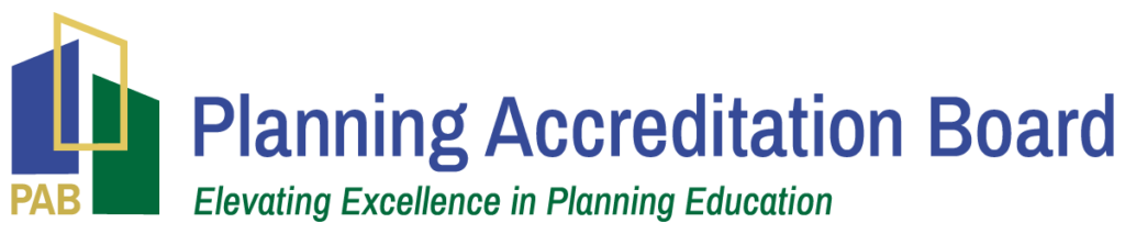
The new PAB visual identity brings those ideas to life. With overlapping shapes that point upward, the PAB logo represents both the connection between planning education and practice and the elevation of the planning profession. PAB sits at the center in gold, a visual reference to accreditation as a recognized “gold star” of quality. Finally, our updated tagline captures the purpose behind the work: Elevating Excellence in Planning Education.
Our new brand identity also reinforces several of PAB’s core pillars that align closely with the work of ACSP, APA, and AICP:
- Connections Across Planning: Strengthening the ecosystem that links education, practice, and professional standards.
- Elevation of the Planning Profession: Increasing visibility and credibility for planning education and its impact.
- Empowerment of Emerging Professionals: Supporting clear pathways to the profession, including alignment with AICP expectations and readiness for certification.
Stay Connected With Us!
Follow our new LinkedIn page for the latest news, updates, insights, and ways to get involved.